
In mid-2024, a mandate came down from R1 RCM’s senior leadership: increase adoption of the inbuilt capabilities on the R1 Decision platform.
R1 Decision is the core workflow tool used by thousands of Associates, Supervisors, and Managers across R1 RCM’s India operations to handle denial management and accounts receivable follow-up, a process that touches over 400 million tasks every year. The platform had the features. People weren’t using them. Leadership wanted that to change.
As Product Design Manager leading the India Design Organisation, this project was mine to run. I had a team, I had stakeholders across product, engineering, and operations, and I had a 6-week deadline tied to a commitment leadership had already made.
What I didn’t have yet was the right problem statement.
A mandate to “increase feature adoption” is a business ask, not a design brief. My first job was to translate one into the other.
Before I pointed my team at anything, I needed to understand why users weren’t trusting the platform. Not from reports or dashboards, but from the people doing the work. That meant going to the source, and it meant going myself.
I’ve seen too many design projects start with everyone silently assuming they know the goal, only to discover three weeks in that they were solving for different things. I wasn’t going to let that happen here, especially not with a 6-week runway.
In that session, I facilitated a conversation that did three things.
First, it defined our success metrics explicitly, not “more platform usage” but specific, measurable outcomes:
reduce tool-switching, reduce time-on-task, reduce error rates.
Second, it mapped our constraints honestly:
legacy backend APIs with limited capabilities, a design system mid-migration, an aggressive delivery timeline.
Third, and most importantly, it named the things we didn’t yet know, the knowledge gaps that research needed to fill before the team could responsibly scope any solution.
Alignment isn’t overhead. Done well, it’s the earliest and most leveraged design decision you make on a project.
That session also built something less tangible but just as important: shared ownership. When the Engineering Manager understood I was treating his constraints as inputs rather than blockers, he leaned in as a collaborator. That dynamic held for the next six weeks.
Before I let the team design a single screen, I needed them to understand the problem the way I was starting to understand it from the inside.
I planned a research phase and made deliberate choices about how to structure it. We would combine contextual enquiry (observing users in their real working environment), one-on-one interviews (understanding the motivations and emotions behind the behaviours), a heuristic evaluation of the existing platform, and an audit of the journey map. Each method would give us a different layer of the same truth.

I joined the field sessions personally, not to lead the research, but to stay close to what the team was learning as they learned it. We visited both the Noida and Gurgaon operations centres. We shadowed Associates, Supervisors, and Managers as they moved through end-to-end workflows. We watched what happened in the moments where the platform failed to support the work: the tab that opened because the information wasn’t accessible in the current screen, the MS Word document that absorbed the notes the platform should have held, the personal Excel spreadsheet tracking high-value accounts because nothing in the system did that job.
“If auth status, clinical notes, and denial reason were all in R1, I could use fewer tabs.” - Associate, Noida
What we found was consistent across every role and both locations. Users weren’t avoiding the platform’s features because they disliked them. They were avoiding them because the platform’s architecture made workarounds faster. Seven tabs were open simultaneously not out of habit, but because no single screen gave a user the information they needed to make a decision.
The heuristic evaluation added structural rigour to what we’d seen in the field: workflow steps lacked context and guidance; critical financial data was buried in dense tables; there was no validation on consequential actions; the call queue gave users no visibility into status, so context was lost between steps. Each finding had a direct thread back to a behaviour we’d observed or a frustration we’d heard.
By the time the team came back from research, they weren’t working from a brief anymore. They were working from conviction. That’s a different thing entirely.
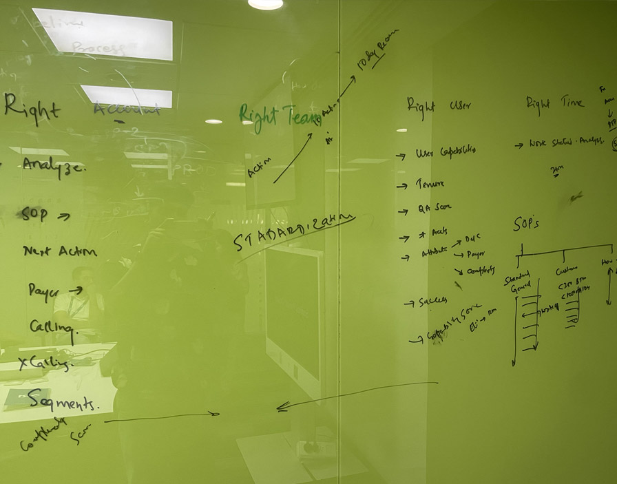
Research without synthesis is noise. My job at this stage was to create the conditions for the team to make sense of what they’d found, and to turn that sense-making into a design direction we could all commit to.
I facilitated a synthesis workshop with the Product Manager and Operations Manager. This wasn’t a design team session behind closed doors, it was a cross-functional working session, because the insights belonged to everyone and the direction needed to be owned by everyone.
We converged on three core opportunity areas.
Consolidating fragmented information: users needed all patient and claim data accessible in a single view, without navigating between tabs.
Redesigning the Notes module: the inbuilt tool was underused not because users didn’t want it, but because it wasn’t designed for how they actually worked it needed to be contextual, auto-saved, and surfaced within the workflow.
Adding status visibility to the call queue, so Associates could pick up where they left off without reconstructing context from scratch.
I pushed the team to define acceptance criteria for each opportunity, not vague ambitions, but specific, testable conditions that would tell us unambiguously whether we’d solved the problem.
About two weeks in, Engineering confirmed what I’d been watching for: the backend APIs couldn’t support real-time data updates. For a redesign built around giving users timely, contextual information, this was a significant constraint.
This is the kind of moment where projects can quietly fall apart. Scope inflates with promises of “we’ll figure that out in Phase 2” that never materialise. Or the ambition collapses so far that the result no longer addresses the original problem. I’d seen both happen.
I chose a different approach. I built a prioritisation matrix with the team, scoring every opportunity against user impact and engineering complexity given the actual constraints we were operating under. I used it not just internally but as a stakeholder communication tool, making the trade-offs visible and bringing the Product Manager and Operations Manager into the decision explicitly.
Real-time flows became near-real-time structured prompts — a design solution that preserved the core user value without requiring impossible backend changes. Full workflow automation moved to a later quarter. The items that remained in Phase 1 were the ones with the highest impact per unit of engineering effort, and I was confident in defending that call because the prioritisation was grounded in the research, not in gut feel.
A manager’s job in moments like this isn’t to protect the team from the hard conversation. It’s to have the hard conversation in the open and come out the other side with a decision everyone owns.
I also introduced a structural change to how Design and Engineering worked together at this point: a two-stage grooming process. Pre-grooming happened at the ideation and concept stage, surfacing technical concerns before the team had invested heavily in any direction. Formal grooming happened once hi-fidelity prototypes were ready, reducing ambiguity before build began. This change didn’t just help this project, it was adopted as a standard team practice afterwards.
With the problem framed, the opportunities defined, and the constraints mapped, I set the team to work. My role at this stage shifted, from leading the discovery to directing the execution.
I facilitated a concept workshop to generate the initial design direction. I came in with provocations rather than answers. The concept that emerged was a three-panel unified interface: a worklist, a consolidated account detail view, and an action panel. Everything a user needed for a claim decision, visible without navigating away.
When I brought this concept to stakeholders, the reaction was immediate. They saw the value clearly. That gave us the mandate to move into prototyping without a prolonged approval cycle.
I directed the team through each design stage, low-fidelity wireframes exploring layout and click-path efficiency, high-fidelity prototypes introducing visual hierarchy and the redesigned Notes experience, and usability validation sessions with Associates, Supervisors, and Managers. At each stage, I was reviewing the work against the research insights and the acceptance criteria we’d defined: were we actually solving the problem we’d identified? Were the design decisions rooted in what we’d heard and observed?
The Notes redesign became the quiet centrepiece of the solution. It hadn’t been the most visible problem, but fixing it drove the most immediate and measurable behaviour change.
I also held the team accountable to the timeline without letting the timeline become the only metric. When usability sessions surfaced something worth iterating on, we iterated. When they confirmed a direction, we moved. The pace was fast, but it was purposeful.
Design handoff, detailed specifications, and QA support all ran through me as well. I wanted to make sure that what Engineering built matched not just the pixel-level intent of the designs, but the reasoning behind them.
We delivered on time.
The redesigned R1 Decision workflow consolidated what had previously required multiple tabs and external tools into a single, coherent interface. Associates now had patient identity, claim status, financial data, eligibility details, and a fully integrated notes and history section all visible in one screen. The Notes module — redesigned to be contextual and auto-saved within the workflow — started seeing genuine adoption almost immediately. Status badges in the call queue meant handovers no longer required rebuilding context from scratch.
The numbers tell part of the story:

But numbers only capture what can be measured. What they don’t capture is the Associate who no longer needs a personal Excel spreadsheet to manage her most important accounts. Or the Supervisor who can assess team workload at a glance instead of piecing it together from separate screens.
The best outcome of this project wasn’t the metrics. It was that the team I led, delivered something that changed how people experienced their work every day.
At an organisational level, the project shifted something in how the Design function was perceived. We hadn’t just delivered screens, we’d delivered a measurable improvement to a business-critical operation. The conversations I got to have with leadership after this project were different from the ones before it. Design had proved it could drive outcomes, not just output.
I want to be honest about what this project was and what it required of me as a manager.
It would have been easy to treat the 6-week deadline as a reason to skip the research, compress the synthesis, and jump straight to design. Every instinct under pressure pushes in that direction. Part of my job was to resist that instinct, and to create the space for the team to do the work properly even when time felt like it was running out.
Framing the problem correctly before the team touched any design tools was the highest-leverage thing I did on this project. The mandate said “increase feature adoption.” The research revealed an architecture problem. Those are not the same solution. If I’d let the team design to the mandate rather than to the insight, we’d have shipped something that looked like progress but didn’t change behaviour.
Building alignment across functions, not just at the start but throughout was the other thing that made the difference. The hard conversations about scope and trade-offs were manageable because the Product Manager, Engineering Manager, and Operations Manager had been part of building the shared understanding that informed those decisions. They weren’t being asked to accept my conclusions. They were being asked to confirm their own.
My job was never to have the best ideas. It was to build a team and a process that consistently produced better ideas than any one person could have alone.
The process change I’m perhaps most proud of is the pre-grooming practice I introduced between Design and Engineering. It’s not glamorous. It doesn’t show up in a portfolio the way a prototype does. But it changed how two teams worked together permanently, and that kind of systemic improvement has a compounding return that individual features don’t.
