Feb – Aug 2026 · from a blank page to launch
A new app for a specific audience
Hike Cinema streams short dramas: series of up to 60 episodes, each one to two minutes long, made for a phone held vertically. The audience is 16–30 year olds in Tier 2 and 3 India who watch in their own language, on budget Android phones, often on prepaid data.
I led design for the whole product — brand identity and every flow on iOS and Android — with a junior designer, product managers and engineering, from first concepts to the dev-ready handoff.
A brand that followed the business
The first identity was built for a premium, global streamer. Midway, research into existing players led Hike to compete for Tier 2–3 India instead. I rebuilt the brand around a Bollywood tone and a Hinglish-native voice, and tested it against three personas: Rahul from Patna, Priya from Coimbatore and Amit from Indore.
“Short drama, made cinematic.”
- Audience
- Short-drama viewers in India and around the world
- Feel
- Premium, kinetic, instantly playable
- Type
- Sora for display, Manrope for text
“Picture Abhi Baaki Hai!”
- Audience
- 16–30 year olds in Tier 2–3 India, across Hindi, Tamil, Telugu, Bengali, Marathi, Kannada and more
- Feel
- Bollywood tone, Hinglish-native voice
- Type
- Caveat for the wordmark only, Poppins headings, DM Sans UI, Noto Sans for every Indic script
- A 22-section brand book for design, marketing, product and business teams.
- A single-blue logo sampled from the real app icon, so every asset matches what ships.
- Noto Sans for every Indic script, so no language looks like an afterthought.
The launch product
Version 1 was designed around one moment: a stranger’s first ten seconds. A splash that sells the product before sign-up, an Apple TV-style hero that crossfades into a muted trailer, a full-screen vertical Explore feed, and a downloads module built for metered data.
Onboarding went through several rounds, taking its UX score from 6.2 to 8.1. Hike Cinema launched on iOS and Android in August 2026 with 82K downloads in the first week and 19 minutes of average watch time per session.
Sep – Oct 2026 · finding out why growth flattened
Growth flattened
By the second month, average watch time and new-user acquisition had stopped climbing. The launch numbers said people were curious; the trend said the product wasn’t turning curiosity into a habit.
Rather than redesign on instinct, we went looking for the cause. The first answer reframed the brief: there were two problems, not one.
Most new users left before they ever pressed play. They couldn’t tell where to tap or what a show was about. Better content can’t fix that.
The few who watched didn’t come back. Nothing pulled a viewer from one episode to the next, or back the next day.
How we researched it
We combined behaviour data with field conversations, so every finding had both a number and a reason.
“Ye show kis baare mein hai?”
What is this show about?
“Free hai kya?”
Is it free?
“Hindi mein nahi hai?”
Isn’t it in Hindi?
“Number kyun chahiye?”
Why do you need my number?
What we found
Five findings held up across the data, the audit and the field sessions. The pattern underneath all of them: intent-led paths worked, passive paths leaked. Home had to do for passive viewers what Search already did for motivated ones.
People stay wherever the app drops them
Ads sent new viewers into the Explore feed — often not the show from the ad. Most reached Home later, but the first screen had already set the session.
The first seconds and the first card decide
Of the people who left within a minute, many left before anything moved on screen, or when we asked for notifications first. Card 1 was the same for everyone.
Choosing yourself means committing more
Depth rose with the effort of choosing: no choice, a light choice (genre), a full choice (search). Passive Home browsing produced the shallowest watching.
Search works — until it doesn’t
Searchers arrived with a show in mind, often from an ad or another platform. Almost half hit a dead end, and a dead end breaks trust in the whole app.
Posters don’t explain the show
Unfamiliar posters, truncated titles and no episode, language or “free” cue. A labelled Watch Now drew ~2.4× the taps of the poster itself.
Oct – Nov 2026 · v2, now in development
Five rules for v2
We kept what worked — the identity, fast play, artwork, language-led browsing — and reframed the feeling: a theatre, not a feed.
- One focus, one buttonOne moving hero instead of a seven-slide carousel; one “Play” per card.
- Explain before the tapHook line, trope, language, episode count and “Free” on the card itself.
- Put the best story where people landCard 1 chosen by intent: what you were watching, the show from your ad, or a proven local hit.
- Ask after you giveNo phone number or push prompt before Episode 1.
- Never a dead endEvery search, lock and empty state offers a next step.
One Home, two people
v1’s Home was the same for everyone. v2 changes card 1 by who’s looking. A new viewer lands on a trailer hero with local social proof and a single Play. A returning viewer lands back in their story — progress, time left, a one-line cliffhanger and Resume.
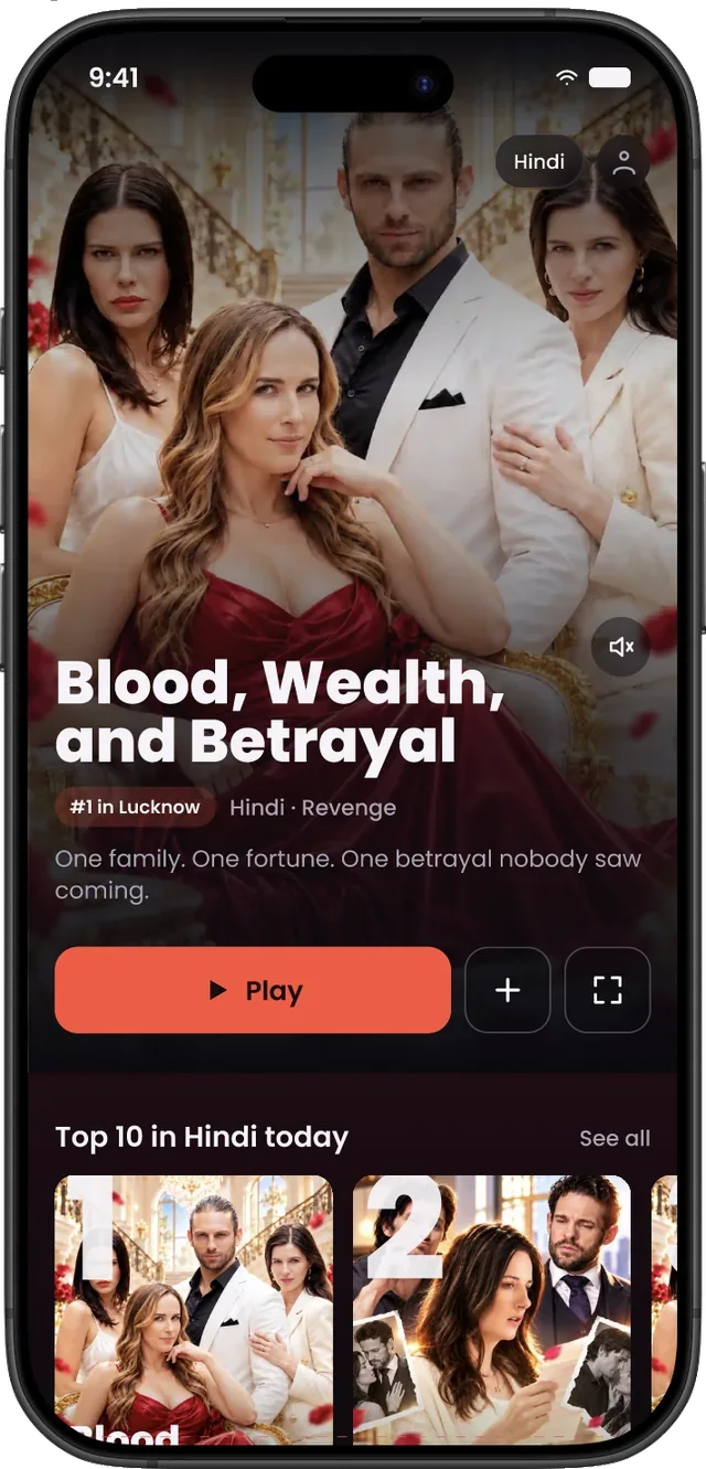
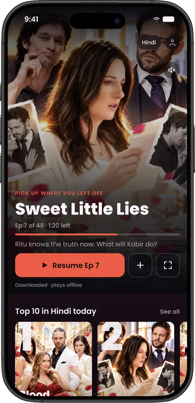
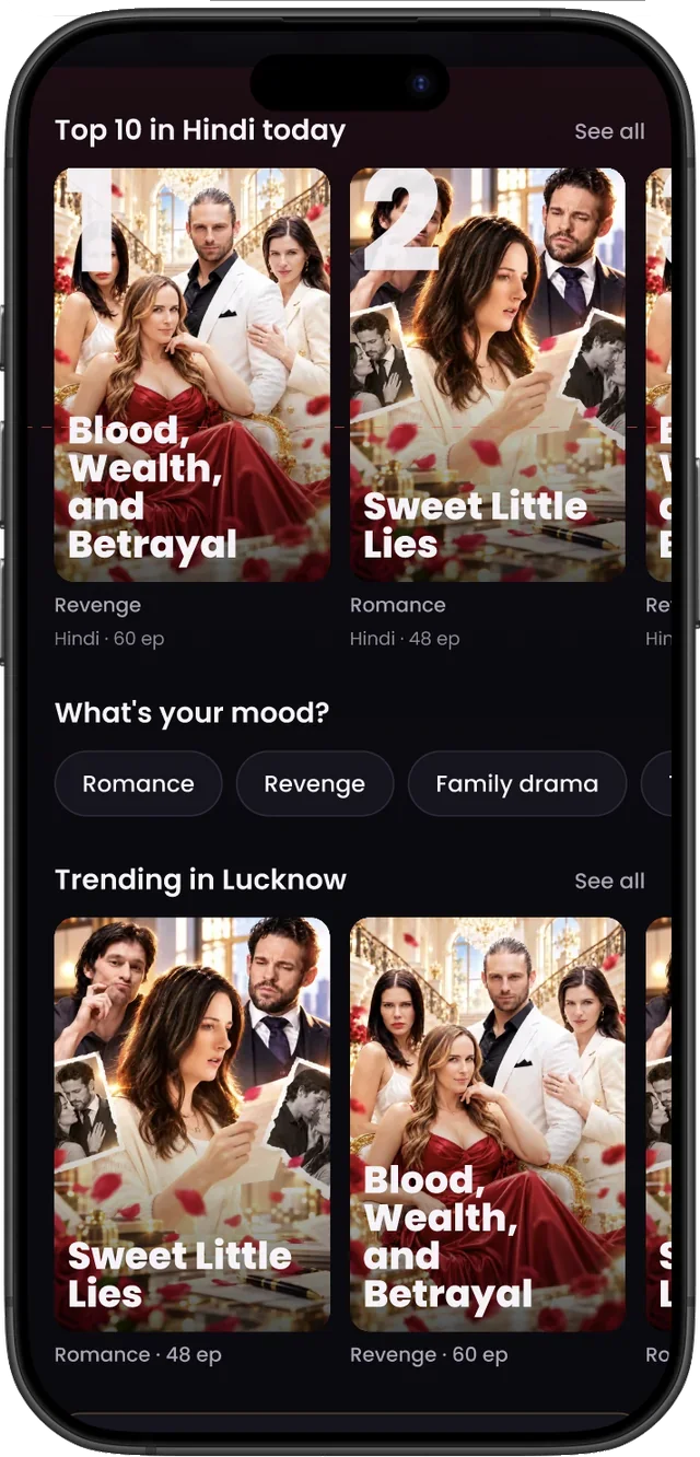
Continue Watching sat below five rails; seven equal rails gave the eye nowhere to land.
So v2Continue moves to card 1 for returners. Rails drop to a few with one card shape and no repeats.
Passive viewers made no choice, so they committed less.
So v2Mood chips — Romance, Revenge, Family drama — give a light, one-tap way to choose.
“Coming Soon” titles looked playable — a severity-4 trust break.
So v2Coming soon has its own rail with a date and Notify me, which also serves sequel hunters.
From Explore to Trailers
Explore was the default landing for 36% of users, yet we couldn’t see what they did there. In v2 the vertical feed becomes Trailers, reached from Home, and every trailer answers the three doubts from the field before the tap: is it free, how long is it, and will it eat my data?
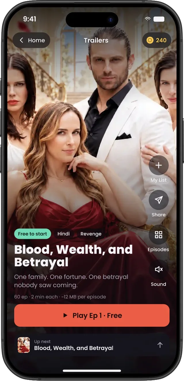
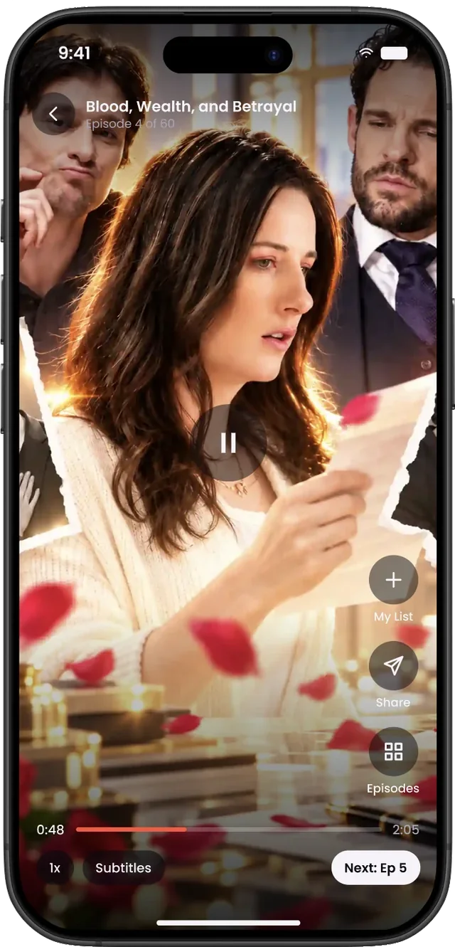
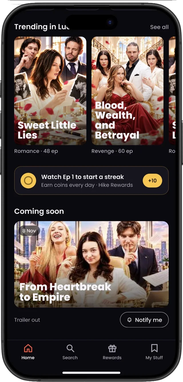
Navigation follows the same logic. Search was used by a third of viewers, so it moves into the bottom bar where the thumb rests. The tabs become Home, Search, Rewards and My Stuff.
Coins without surprises
The journey map flagged a likely “surprise lock” at the end of the free episodes — the moment a hooked viewer can feel tricked. v2 makes the cost visible before it’s a problem, and always offers a free way forward.
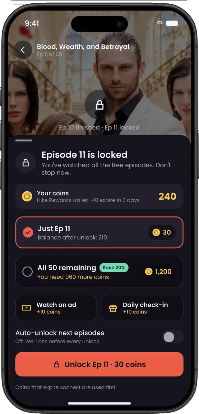
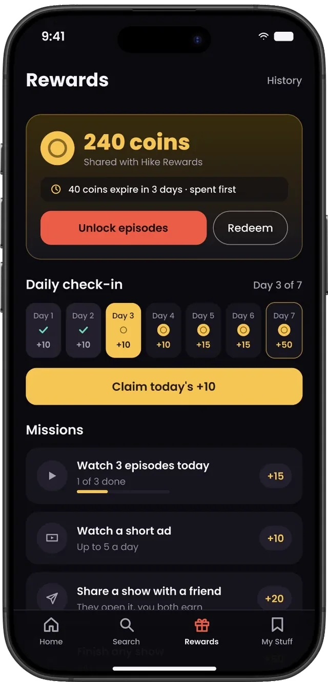
- Never make people do maths. The sheet shows the balance after unlocking, and exactly how many more coins a bundle needs.
- Consent over convenience. Auto-unlock is off by default: “We’ll ask before every unlock.”
- Spend what’s expiring first. Coins shared with Hike Rewards are used soonest-to-expire, and the Rewards tab says so.
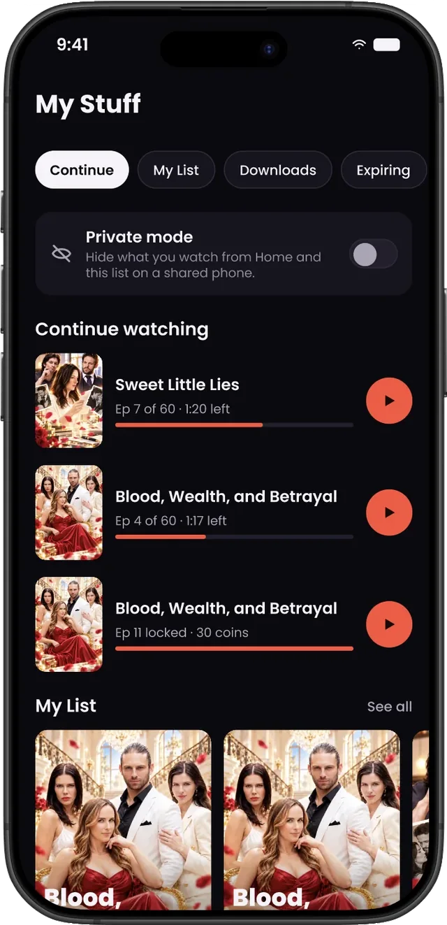
- Private mode. The field research raised privacy on shared family phones, so viewers can hide their history from Home and My Stuff.
Search that never dead-ends
Search had the most committed viewers and the most broken promises. v2 keeps every query moving toward a play.
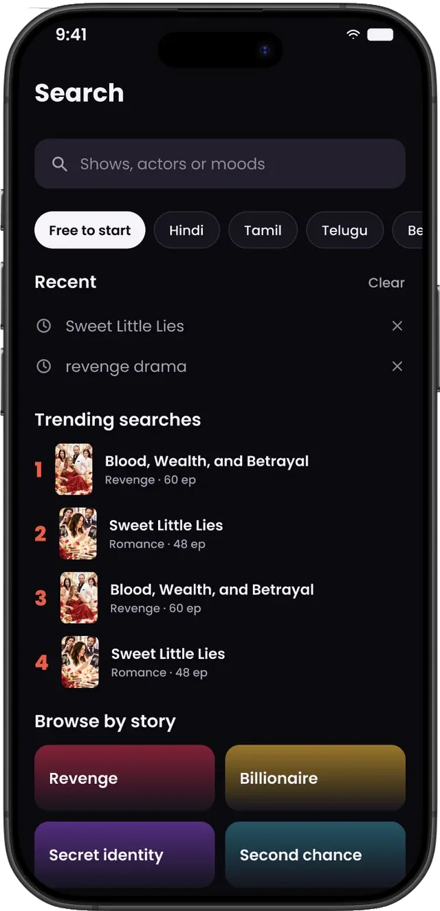
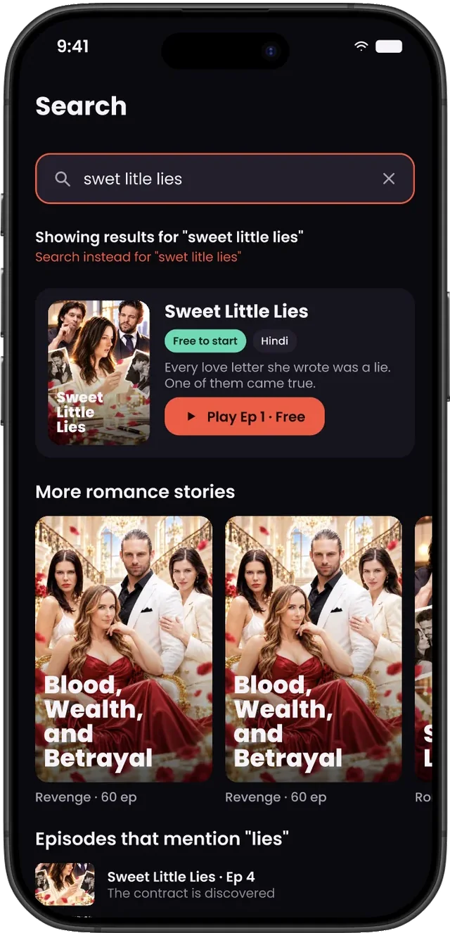
42.8% of search-bar users got nothing; misses were named titles, often from other platforms.
So v2“Did you mean”, similar shows by trope, episodes that mention the term, and Notify me for sequels.
Decisions and trade-offs
Fix activation before habit
Day-0 problems were bigger and cheaper to test. Habit work (reminders, sequels) gets its own research round.
Keep the product, reframe the feeling
The brand and core flows worked. A redesign for novelty would have reset what users had already learned.
Sign-up at the cliffhanger, not the door
“Number kyun chahiye?” — ask when motivation peaks, after the story has earned it.
Measure before we trust
Explore had no tracking. Per-card impressions and taps ship first, so v2 is judged on data, not taste.
What we’re measuring
v2 is in development. Each change is written as a testable hypothesis, with launch numbers as the baseline. It will be validated with first-click and 5-second tests, then an A/B test of the new Home against the current one.
| # | We believe that… | Measured by |
|---|---|---|
H1 | A trailer hero that moves the moment Home opens | D0 play rate, time to first tap |
H2 | Fewer, consistent rails and bigger cards | Tap rate by card position |
H3 | “Free · Ep 1–N” and episode count on every card | Card tap rate, Episode 1 starts |
H4 | Social proof — “#1 in Lucknow”, Top 10 — on the hero | Hero tap rate (A/B) |
H5 | Ads deep-link to the advertised show | D0 play rate for ad installs |
H6 | Sign-up moved from the front door to a cliffhanger | Onboarding → Episode 1 conversion |
H7 | Continue as card 1, plus a cliffhanger reminder | D3 return of day-0 watchers |
H8 | “Did you mean”, similar shows and Notify me in Search | Search bar → play rate |
What I learned
Designing for the first session and the thirtieth are different jobs. Launch taught us what made people curious; research taught us what made them stay. The best decision was to stop guessing and measure first.